Quest for Positive Relative Returns Graphs Updated
Relative returns graphs for all clubs participating in the Quest for Positive Relative Returns have now been updated through May 1, 2011. You'll find the links to your updated graphs on your club pages.
I've also put together a composite graph that you can use to compare your results to:

The red line is the average relative return for each time period for all the clubs who are participating. The bars show you the range of relative returns during the same times.
Don't forget that any relative return greater than 0 means that your money was growing faster in your club than if you had invested it into the Vanguard Index 500 fund (VFINX).
If your club is not yet a member of the Quest for Positive Relative Returns, feel free to email us at support@bivio.com and we'll be glad to make you a graph for your club.
--
Laurie Frederiksen
Invest with your friends!
www.bivio.com
Become our Facebook friend! www.facebook.com/bivio
Follow us on twitter! www.twitter.com/bivio
I've also put together a composite graph that you can use to compare your results to:
The red line is the average relative return for each time period for all the clubs who are participating. The bars show you the range of relative returns during the same times.
Don't forget that any relative return greater than 0 means that your money was growing faster in your club than if you had invested it into the Vanguard Index 500 fund (VFINX).
If your club is not yet a member of the Quest for Positive Relative Returns, feel free to email us at support@bivio.com and we'll be glad to make you a graph for your club.
--
Laurie Frederiksen
Invest with your friends!
www.bivio.com
Become our Facebook friend! www.facebook.com/bivio
Follow us on twitter! www.twitter.com/bivio
| Laurie, Thank you showing us this information in this format. Your program is a wake up call for those of us are below the zero line, but seeing the results above the line gives us hope and solid goals. It would be interesting to see another chart based on percentages at various placement points. The red line indicates that the majority of the clubs did better coming out of the recession, and have trended worse since, but a clearer breakdown would be insightful. Anyway, thank you for tackling this project. Roy Chastain "Good judgment comes from experience, and a lot of that comes from bad judgment." Will Rogers --- On Thu, 6/2/11, Laurie Frederiksen <laurie@bivio.biz> wrote:
|
Thank you Butch and Roy for your kind comments.
--
Laurie Frederiksen
Invest with your friends!
www.bivio.com
Become our Facebook friend! www.facebook.com/bivio
Follow us on twitter! www.twitter.com/bivio
I do think it helps to understand where you are and to have a goal to help focus decision making.
I'm not sure I completely understand what other type of graph you are describing Roy. I'd be glad to discuss other reporting possibilities further.
I'm not sure I completely understand what other type of graph you are describing Roy. I'd be glad to discuss other reporting possibilities further.
Laurie Frederiksen
Invest with your friends!
www.bivio.com
Become our Facebook friend! www.facebook.com/bivio
Follow us on twitter! www.twitter.com/bivio
Laurie – Great graph. It would be fabulous if each club could have their own relative return as a green line (yes, green - like money!) on this graph.
Mark Eckman
From: club_cafe@bivio.com [mailto:club_cafe@bivio.com] On Behalf Of Laurie Frederiksen
Sent: Thursday, June 02, 2011 8:57 AM
To: The Club Cafe
Subject: [club_cafe] Quest for Positive Relative Returns Graphs Updated
Relative returns graphs for all clubs participating in the Quest for Positive Relative Returns have now been updated through May 1, 2011. You'll find the links to your updated graphs on your club pages.
I've also put together a composite graph that you can use to compare your results to: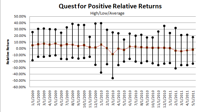
The red line is the average relative return for each time period for all the clubs who are participating. The bars show you the range of relative returns during the same times.
Don't forget that any relative return greater than 0 means that your money was growing faster in your club than if you had invested it into the Vanguard Index 500 fund (VFINX).
If your club is not yet a member of the Quest for Positive Relative Returns, feel free to email us at support@bivio.com and we'll be glad to make you a graph for your club.
--
Laurie Frederiksen
Invest with your friends!
www.bivio.com
Become our Facebook friend! www.facebook.com/bivio
Follow us on twitter! www.twitter.com/bivio
I printed the email out and drew my club's relative return myself. It just took a few minutes. It is easy to see how your club does against the other clubs. I think that my club will be interested to see it at the next meeting. We hung around the average until Sep '10 and then shot up and then had the highest or close to the highest returns since then.
Laurie - an alternative to what Mark suggested. If it is too much trouble for you to do the green line for each club, you can post the highs, averages and lows then the clubs can do it themselves on Excel.
John Rice
From: Mark Eckman <mark2459@gmail.com>
To: club_cafe@bivio.com
Sent: Thu, June 2, 2011 4:38:51 PM
Subject: RE: [club_cafe] Quest for Positive Relative Returns Graphs Updated
Laurie - Great graph. It would be fabulous if each club could have their own relative return as a green line (yes, green - like money!) on this graph.
Mark Eckman
From: club_cafe@bivio.com [mailto:club_cafe@bivio.com] On Behalf Of Laurie Frederiksen
Sent: Thursday, June 02, 2011 8:57 AM
To: The Club Cafe
Subject: [club_cafe] Quest for Positive Relative Returns Graphs Updated
Relative returns graphs for all clubs participating in the Quest for Positive Relative Returns have now been updated through May 1, 2011. You'll find the links to your updated graphs on your club pages.
I've also put together a composite graph that you can use to compare your results to:
The red line is the average relative return for each time period for all the clubs who are participating. The bars show you the range of relative returns during the same times.
Don't forget that any relative return greater than 0 means that your money was growing faster in your club than if you had invested it into the Vanguard Index 500 fund (VFINX).
If your club is not yet a member of the Quest for Positive Relative Returns, feel free to email us at support@bivio.com and we'll be glad to make you a graph for your club.
--
Laurie Frederiksen
Invest with your friends!
www.bivio.com
Become our Facebook friend! www.facebook.com/bivio
Follow us on twitter! www.twitter.com/bivio
Preparing these graphs is an evolutionary process. As I work on them the VBA code evolves more and more to simplify and speed up the process.
I realized when I was about 98% through that it would be nice to put the comparison average line on everyones club graphs so I did figure out a way to do it.
It's kind of a chicken and egg thing though. I can't add the line or make your graph until I generate all the data. I'll need to figure out a work flow sequence to do that in the future and still keep the time to prep the info manageable.
But, to make a long story short, Club Cafe members are special so let me know if you want your graph to show the average line and I'll generate a new one for you.
I really like the proposal to make the club line green. I had originally chosen Red but I think that green is a good next evolutionary step. After all, it is also a bivio signature color. Thanks Mark!
--
Laurie Frederiksen
Invest with your friends!
www.bivio.com
Become our Facebook friend! www.facebook.com/bivio
Follow us on twitter! www.twitter.com/bivio
Diamonds in the Rough would love to see the average line. Or if there is a way to download into Excel, I’d love someone to teach me how. My Excel skills are limited.
Thanks for what you do. It is so appreciated.
Marlene
From: club_cafe@bivio.com [mailto:club_cafe@bivio.com] On Behalf Of Laurie Frederiksen
Sent: Thursday, June 02, 2011 8:27 PM
To: club_cafe@bivio.com
Subject: Re: [club_cafe] Quest for Positive Relative Returns Graphs Updated
Preparing these graphs is an evolutionary process. As I work on them the VBA code evolves more and more to simplify and speed up the process.
I realized when I was about 98% through that it would be nice to put the comparison average line on everyones club graphs so I did figure out a way to do it.
It's kind of a chicken and egg thing though. I can't add the line or make your graph until I generate all the data. I'll need to figure out a work flow sequence to do that in the future and still keep the time to prep the info manageable.
But, to make a long story short, Club Cafe members are special so let me know if you want your graph to show the average line and I'll generate a new one for you.
I really like the proposal to make the club line green. I had originally chosen Red but I think that green is a good next evolutionary step. After all, it is also a bivio signature color. Thanks Mark!
--
Laurie Frederiksen
Invest with your friends!
www.bivio.com
Become our Facebook friend! www.facebook.com/bivio
Follow us on twitter! www.twitter.com/bivio
Yes, Mahogany Money Makers would like the average line on our graph.
Thanks!
Sent from my iPhone
Sent from my iPhone
Preparing these graphs is an evolutionary process. As I work on them the VBA code evolves more and more to simplify and speed up the process.
I realized when I was about 98% through that it would be nice to put the comparison average line on everyones club graphs so I did figure out a way to do it.
It's kind of a chicken and egg thing though. I can't add the line or make your graph until I generate all the data. I'll need to figure out a work flow sequence to do that in the future and still keep the time to prep the info manageable.
But, to make a long story short, Club Cafe members are special so let me know if you want your graph to show the average line and I'll generate a new one for you.
I really like the proposal to make the club line green. I had originally chosen Red but I think that green is a good next evolutionary step. After all, it is also a bivio signature color. Thanks Mark!
--
Laurie Frederiksen
Invest with your friends!
www.bivio.com
Become our Facebook friend! www.facebook.com/bivio
Follow us on twitter! www.twitter.com/bivio
ABODI Investment Club would love the average line too.
From: Laurie Frederiksen <laurie@bivio.biz>
To: club_cafe@bivio.com
Sent: Thu, June 2, 2011 6:26:40 PM
Subject: Re: [club_cafe] Quest for Positive Relative Returns Graphs Updated
Preparing these graphs is an evolutionary process. As I work on them the VBA code evolves more and more to simplify and speed up the process.
I realized when I was about 98% through that it would be nice to put the comparison average line on everyones club graphs so I did figure out a way to do it.
It's kind of a chicken and egg thing though. I can't add the line or make your graph until I generate all the data. I'll need to figure out a work flow sequence to do that in the future and still keep the time to prep the info manageable.
But, to make a long story short, Club Cafe members are special so let me know if you want your graph to show the average line and I'll generate a new one for you.
I really like the proposal to make the club line green. I had originally chosen Red but I think that green is a good next evolutionary step. After all, it is also a bivio signature color. Thanks Mark!
--
Laurie Frederiksen
Invest with your friends!
www.bivio.com
Become our Facebook friend! www.facebook.com/bivio
Follow us on twitter! www.twitter.com/bivio
I’ll add one more future dream. With the red and green lines, we can compare the relative return of our club to the market, but it would be a neat feature to have a blue line to measure the average relative return of all other bivio clubs. (Think of the contests that would come about from those numbers!) Club’s could see how they do in the long term vs. short term, bear market vs. bull market or whatever time frame chosen!!! A real tool to measure how well clubs understands portfolio management for total return.
Mark
From: club_cafe@bivio.com [mailto:club_cafe@bivio.com] On Behalf Of Laurie Frederiksen
Sent: Thursday, June 02, 2011 8:27 PM
To: club_cafe@bivio.com
Subject: Re: [club_cafe] Quest for Positive Relative Returns Graphs Updated
Preparing these graphs is an evolutionary process. As I work on them the VBA code evolves more and more to simplify and speed up the process.
I realized when I was about 98% through that it would be nice to put the comparison average line on everyones club graphs so I did figure out a way to do it.
It's kind of a chicken and egg thing though. I can't add the line or make your graph until I generate all the data. I'll need to figure out a work flow sequence to do that in the future and still keep the time to prep the info manageable.
But, to make a long story short, Club Cafe members are special so let me know if you want your graph to show the average line and I'll generate a new one for you.
I really like the proposal to make the club line green. I had originally chosen Red but I think that green is a good next evolutionary step. After all, it is also a bivio signature color. Thanks Mark!
--
Laurie Frederiksen
Invest with your friends!
www.bivio.com
Become our Facebook friend! www.facebook.com/bivio
Follow us on twitter! www.twitter.com/bivio
I think you've already got this. (I've already updated the graphs for those who've asked) The green line is your clubs relative return. The yellow line is the average relative return for all the clubs who are currently participating in the QPRR.
I may be misunderstanding what you are asking for. Feel free to elaborate further if I am.
Laurie
I may be misunderstanding what you are asking for. Feel free to elaborate further if I am.
Laurie
On Thu, Jun 2, 2011 at 10:46 PM, Mark Eckman <mark2459@gmail.com> wrote:
I'll add one more future dream. With the red and green lines, we can compare the relative return of our club to the market, but it would be a neat feature to have a blue line to measure the average relative return of all other bivio clubs. (Think of the contests that would come about from those numbers!) Club's could see how they do in the long term vs. short term, bear market vs. bull market or whatever time frame chosen!!! A real tool to measure how well clubs understands portfolio management for total return.
Mark
You''re right! I guess I'm still wrapping my head around this and blew right past the thought that the center line at 0% IS the market. DUH!! (Must have misplaced those brain cells, again.) Anyway, could you please add Nationwide Investment Club to your project? Thanks, this is really great stuff.
On Thu, Jun 2, 2011 at 10:01 PM, Laurie Frederiksen <laurie@bivio.biz> wrote:
I think you've already got this. (I've already updated the graphs for those who've asked) The green line is your clubs relative return. The yellow line is the average relative return for all the clubs who are currently participating in the QPRR.
I may be misunderstanding what you are asking for. Feel free to elaborate further if I am.
Laurie
On Thu, Jun 2, 2011 at 10:46 PM, Mark Eckman <mark2459@gmail.com> wrote:
I'll add one more future dream. With the red and green lines, we can compare the relative return of our club to the market, but it would be a neat feature to have a blue line to measure the average relative return of all other bivio clubs. (Think of the contests that would come about from those numbers!) Club's could see how they do in the long term vs. short term, bear market vs. bull market or whatever time frame chosen!!! A real tool to measure how well clubs understands portfolio management for total return.
Mark
Could you add Women Of Wauneta Investment club to this new QPRR graph.
c goings
c goings
On Fri, Jun 3, 2011 at 6:53 AM, Mark Eckman <mark2459@gmail.com> wrote:
You''re right! I guess I'm still wrapping my head around this and blew right past the thought that the center line at 0% IS the market. DUH!! (Must have misplaced those brain cells, again.) Anyway, could you please add Nationwide Investment Club to your project? Thanks, this is really great stuff.
On Thu, Jun 2, 2011 at 10:01 PM, Laurie Frederiksen <laurie@bivio.biz> wrote:
I think you've already got this. (I've already updated the graphs for those who've asked) The green line is your clubs relative return. The yellow line is the average relative return for all the clubs who are currently participating in the QPRR.
I may be misunderstanding what you are asking for. Feel free to elaborate further if I am.
Laurie
On Thu, Jun 2, 2011 at 10:46 PM, Mark Eckman <mark2459@gmail.com> wrote:
I'll add one more future dream. With the red and green lines, we can compare the relative return of our club to the market, but it would be a neat feature to have a blue line to measure the average relative return of all other bivio clubs. (Think of the contests that would come about from those numbers!) Club's could see how they do in the long term vs. short term, bear market vs. bull market or whatever time frame chosen!!! A real tool to measure how well clubs understands portfolio management for total return.
Mark
Can you add these updates to the Aardvark Inv Club....Thanks Laurie for all you do.
Barbara
Barbara
-----Original Message-----
From: Laurie Frederiksen <laurie@bivio.biz>
To: club_cafe@bivio.com
Sent: Thu, Jun 2, 2011 10:01 pm
Subject: Re: [club_cafe] Quest for Positive Relative Returns Graphs Updated
From: Laurie Frederiksen <laurie@bivio.biz>
To: club_cafe@bivio.com
Sent: Thu, Jun 2, 2011 10:01 pm
Subject: Re: [club_cafe] Quest for Positive Relative Returns Graphs Updated
I think you've already got this. (I've already updated the graphs for those who've asked) The green line is your clubs relative return. The yellow line is the average relative return for all the clubs who are currently participating in the QPRR.
I may be misunderstanding what you are asking for. Feel free to elaborate further if I am.
Laurie
I may be misunderstanding what you are asking for. Feel free to elaborate further if I am.
Laurie
On Thu, Jun 2, 2011 at 10:46 PM, Mark Eckman <mark2459@gmail.com> wrote:
I'll add one more future dream. With the red and green lines, we can compare the relative return of our club to the market, but it would be a neat feature to have a blue line to measure the average relative return of all other bivio clubs. (Think of the contests that would come about from those numbers!) Club's could see how they do in the long term vs. short term, bear market vs. bull market or whatever time frame chosen!!! A real tool to measure how well clubs understands portfolio management for total return.Mark
Same for Mt. Ararat. Thanks.
From: Colleen Goings
Sent: Friday, June 03, 2011 9:36 AM
Subject: Re: [club_cafe] Quest for Positive Relative Returns Graphs
Updated
Could
you add Women Of Wauneta Investment club to this new QPRR graph.
c goings
c goings
On Fri, Jun 3, 2011 at 6:53 AM, Mark Eckman <mark2459@gmail.com> wrote:
You''re right! I guess I'm still wrapping my head around this and blew right past the thought that the center line at 0% IS the market. DUH!! (Must have misplaced those brain cells, again.) Anyway, could you please add Nationwide Investment Club to your project? Thanks, this is really great stuff.
On Thu, Jun 2, 2011 at 10:01 PM, Laurie Frederiksen <laurie@bivio.biz> wrote:
I think you've already got this. (I've already updated the graphs for those who've asked) The green line is your clubs relative return. The yellow line is the average relative return for all the clubs who are currently participating in the QPRR.
I may be misunderstanding what you are asking for. Feel free to elaborate further if I am.
Laurie
On Thu, Jun 2, 2011 at 10:46 PM, Mark Eckman <mark2459@gmail.com> wrote:
I'll add one more future dream. With the red and green lines, we can compare the relative return of our club to the market, but it would be a neat feature to have a blue line to measure the average relative return of all other bivio clubs. (Think of the contests that would come about from those numbers!) Club's could see how they do in the long term vs. short term, bear market vs. bull market or whatever time frame chosen!!! A real tool to measure how well clubs understands portfolio management for total return.
Mark